
Easily Advertise Your Business with Postcards
At Foote Printing, one way that we can help you and your business is with an old fashion postcard mailer. A postcard is an easy and inexpensive way for you to market your company to many potential customers who you might not be able to reach otherwise.
Postcard Mailers with Foote Printing
Our postcard, or every door-direct mailers, are extremely easy to get and completely customizable. You can do full color, black and white, two-sided, one-sided, you name it!
The nice thing about our postcard is that the endicia or "postage code" only take up the size of a postage stamp! This means that the rest of the card is yours to fill.
The paperweight is a standard nine-point postcard, so you won't be spending any extra in postage due to heavy mail.
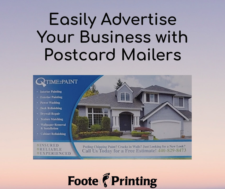
Time2Paint Postcard Example
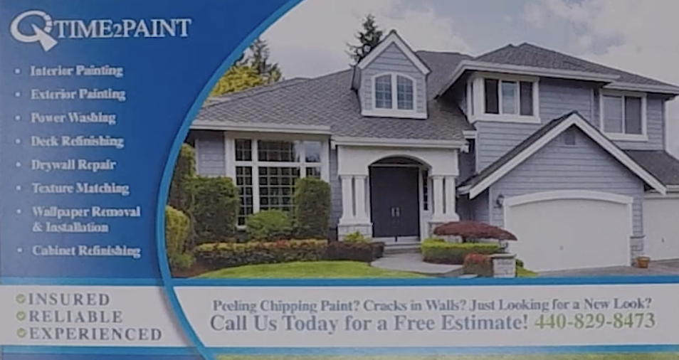
The results for this customer's mailer was very successful. We sent this out to about 5,000 residents in the Rocky River area, and he got a call the same day. Then, he ended up booking three jobs. In total, he got about $12,000 worth of business from using this direct mailer.
We helped with the design aspect and mailed these cards for the customer. After those services, Time2Paint only spent about $1,000 on this print marketing! That's incredibly low for the leads they gained and profits they made.
If you need help with marketing your business, especially if you're a business to consumer company, then consider direct mailer postcards from Foote Printing. They are definitely worth the investment and very easy to do! If you have any questions about how they work or what you can do with these postcards, contact us today at Foote Printing!

 ©
©